


Honestly, when people ask me to show them the "perfect white", I want to look both ways and run! You would think that because this color is having, dare I say, a white hot moment, that we designers would have narrowed it down to One Ideal White... but guess what? It doesn't work that way.
White is so easy to do wrong
Seeing and using color is all about relationships. Even white is a color. "Of course it is", you say, but how many of us remember being taught that white is the absence of all color? Most of us were kids when we learned basic color theory, and that kind of learning is hard to undo.
Color is all about relationships
No paint colors exist in a vacuum, instead, they interact with each other. That's why designers ask to see your tile, cabinets, flooring, fabrics, art - all those elements that add up to make the space unique - so we can see the relationship of these items to each other, and choose colors accordingly.
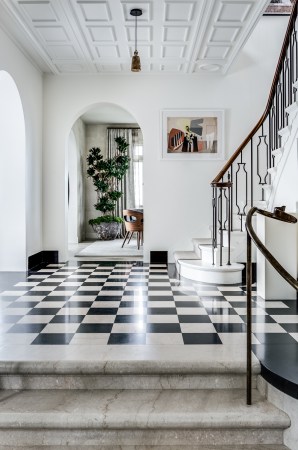
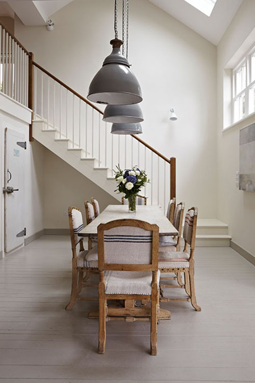
When it comes to white, it can be more challenging to discern the nuances of the color - does it lean towards yellow? Does it go green? Is it a crispy clean color or more shaded?
White is so pale, it can be tough to see what direction on the color wheel it leans. Even understanding if you are looking at a cool or warm color can be hard to tell because the difference on a small chip or sample is quite subtle. Until you paint out a room and realize that you've made the wrong call. Again.
That's why it's so difficult to find the perfect white. One white does not do it all.
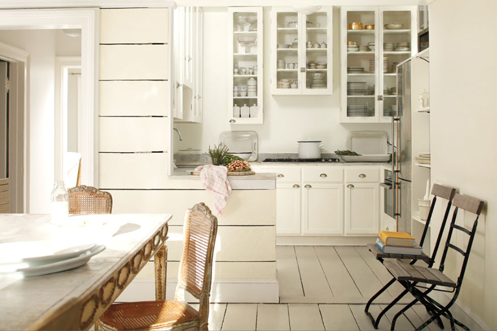
In the paint industry, there is a commonly named color (although formulas vary different from brand to brand) known as One Coat White. This is a white that on the surface appears like a nice basic white. One coat sounds good, right? However, if you hold the color chip next to a different white, you'll see how "dirty" that One Coat White appears. Most of them contain a lot of black pigment, which provides hiding properties while using a cheap pigment (did you know that individual pigments have different costs that vary widely?), in their color recipes. And once you compare it to other whites, you'll understand how properly seeing whites can be challenging. Oh, and you'll never what to use it, it's ugly.
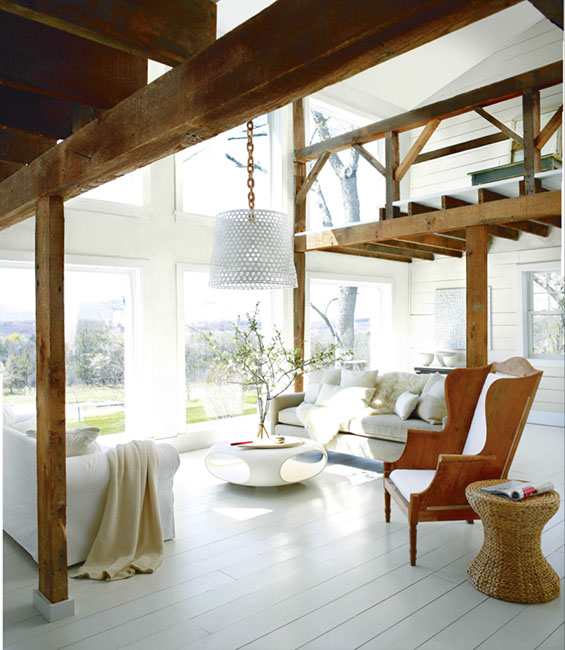
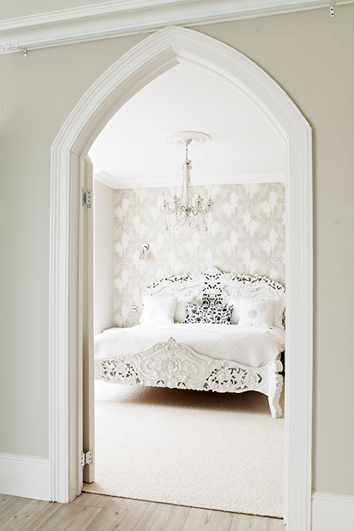
Here's another issue, a lot of new construction leans towards using the whitest of whites for both interior and exterior trims
In my opinion, while using a bright white can create a crispy clean look, it's also tooooooooo darn bright! White trim provides a lot of contrast, but sometimes it's just too much, and not easy on the eye. Instead, use a white formulation that contains a little bit of umber pigment, it will still look nice and fresh, but not harsh.
White is sticking around for a while
It's been the go-to trim choice for at least 20 years (but, by no means the only choice... really!), and right now it's strongly trending as both a trim and wall color - thanks to social media becoming so image focused, white backdrops look great on small screens, and we are highly influenced by what we are seeing digitally.
Going forward, I predict a swing towards more nuanced mid-value colors and toned whites. Color trends are always evolving, and they never stay stuck in one place for too long. Don't worry, if you are looking for colors that are trend-proof, white will never go away. Just like the Little Black Dress, white will always be a part of the design toolbox.
#perfectwhites, #whitepaint, #benjainmoorewhite, #farrowandballwhite, #c2white, #whitetrim, #whitewalls
Comments